


WordPress 7.1 release leans hard into three things: how sites respond across devices, how teams work together inside the editor, and how much friction there is in day-to-day site management. None of it is flashy. Most of it is the kind of change you only notice a few weeks in, when you realize you’ve stopped reaching for a plugin, or stopped writing custom CSS you’ll forget about by next quarter.
Table of Contents:
- WordPress 7.1: The Features That Actually Matter for Site Builders
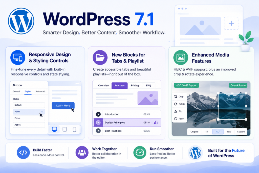
- Responsive Design and Styling Controls
- New Blocks for Playlist and Tabs
- Enhanced Media Features
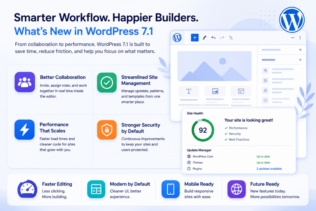
- Asynchronous Team Collaboration
- Admin Experience Improvements
- Built for Developers
- Last Words
Responsive Design and Styling Controls
WordPress 7.1 introduces this as the change most builders will feel first, because it chips away at that old reflex: “I’ll just drop in some custom CSS and deal with it later.”
In WordPress 6.x, responsive and interactive styling tended to live in three separate places at once. The Site Editor handled the basics, theme.json set the sane defaults, and a growing file of custom CSS mopped up everything else: hover states, focus rings, that one button that needed a different background on mobile, weird spacing at tablet width.
The main problem faced by most WordPress users was remembering where you’d fixed something earlier. Six weeks later, you’d forget that fixing place, unintentionally touch the wrong layer, and quietly undo your own fix.
But WordPress 7.1’s goal is that designers ask for these constantly: interactive states, hover, focus, active, and if accessibility is part of your process, you want focus styles you’re actually willing to defend in a review. Instead of inventing a custom class and hand-writing the CSS, you set it right where the button already lives.
Here’s roughly how this changes my day-to-day when I’m building a block theme:
- Global tokens: colour, type, spacing, go in theme.json.
- Editor controls handle the per-block exceptions, like the hero CTA that needs to stand out from everything else.
- Custom CSS gets reserved for genuinely custom work: animations, gnarly selectors, quirks from third-party markup.
In practice, you still need a testing routine, because giving people more styling power inside the editor also means more ways for a client to style themselves into a corner without meaning to.
New Blocks for Playlist and Tabs:
Adding blocks to core is always a trade-off: fewer plugins to manage, but more surface area WordPress allows to solve playlist and tabs problems because I’ve watched teams patch badly, over and over, for years.
Start with Tabs, since it’s the one people tend to implement dangerously.
In the wild, tabs usually come from one of three places: a page builder widget, a shortcode pulled from some plugin nobody quite remembers installing, or a developer who hand-rolled the markup and forgot about keyboard navigation.
The result often looks fine and fails the moment someone actually tests it: the tabs aren’t reachable by keyboard, the active state isn’t announced to screen readers, or the content jumps around in a way that’s confusing on a phone.
Where I’d actually use it on a real business site:
- Services page — “What you get,” “Timeline,” “FAQ,” “Pricing notes.”
- Documentation — “WordPress,” “Shopify,” “Headless,” where most of the content is shared, and only a fifth of it actually differs.
- Course site — “Lesson notes,” “Resources,” “Transcript.”
Then there’s Playlist, introduced in WordPress 7.1, less exciting, but the kind of unglamorous block that quietly makes real sites better. Podcasts, sermon archives, training portals, band websites, museums; these are the people who just want a clean media list that survives a theme change.
Enhanced Media Features
Media is where most WordPress sites actually slow down and where people blame “WordPress” instead of the 38MB hero image somebody uploaded straight off a DSLR.
So it’s good to see 7.1 adding HEIC and AVIF support, along with a better crop-and-rotate experience. These are the unglamorous upgrades that make a content team faster and a site lighter, without a developer having to babysit every single upload.
On formats:
Format support alone doesn’t fix bad habits, though; teams will still upload whatever looks fine in the moment unless there’s a process behind it.
Here’s what I actually walk editors through, because it cuts down support tickets:
- Start with sane dimensions. If your content column is 1200px wide, don’t upload something 6000px wide “just in case.”
- Let WordPress generate the responsive sizes. Don’t hardcode one giant image and call it done.
- Compress with intention. AVIF is great when it’s available, but check the quality; if you see banding, fall back to WebP or JPEG depending on how the site’s set up.
- Name files the way a person would search for them. team-retreat-2026.jpg tells you something six months from now. IMG_9483.HEIC tells you nothing.
Then there’s the crop and rotate interface, which sounds minor until you watch a non-designer struggle with it. A better UI here means fewer “can you crop this for me?” messages landing in your inbox, and fewer layouts broken because someone dropped a portrait photo into a landscape slot and hoped CSS would sort it out.
If cropping and rotating genuinely get faster in 7.1, lean into it. I’d rather maintain two properly-cropped images than one “universal” image that looks wrong everywhere it’s used.
And don’t skip the boring performance checks after a media-heavy update:
- Run a page through Lighthouse before and after.
- Check for layout shift and network waterfall caused by missing width/height attributes or inconsistent image sizing.
Asynchronous Team Collaboration
Collaboration inside WordPress has always been a bit awkward. Teams end up collaborating around it instead: Slack threads, email chains, Google Docs, and then one person becomes the human merge tool who translates all of that into actual edits.
WordPress 7.1 doesn’t give you real-time, multiple-cursors editing. What it does ship is an expanded Notes feature, and for teams that can’t justify bolting on a separate editorial workflow tool, that’s a genuinely useful step.
Rich text, emoji reactions, and @mentions sound like small conveniences, but they solve real friction. @mentions cut down the “did you even see my message?” lag, and reactions let a stakeholder confirm something without adding another comment nobody needs to read.
On a typical mid-sized content team, one developer, one marketer, two editors, and a legal reviewer who shows up once a month, here’s roughly how I’d expect Notes to get used:
- An editor drafts the page and leaves a note for marketing: “Should this CTA point to the demo or to pricing?”
- Marketing replies with the decision and drops in the exact UTM link.
- Legal flags the claims section: “Need to pull the word ‘guaranteed’ out of here.”
- The developer tags themselves on a layout bug: “Spacing between Tabs and Playlist collapses on iPad, fixing in the theme.”
That’s asynchronous, but it stays anchored to the thing that actually matters: the page itself. A simple team rule fixes most of it: resolve or delete a Note once the change is made. If a discussion needs to run long, take it to your project tool and keep Notes for page-specific decisions only.
Admin Experience Improvements
WordPress 7.1 admin UI changes tend to be polarizing, because the old layout is muscle memory at this point. Even so, when navigation genuinely improves, especially for anyone managing more than one site, it saves real time, not just theoretical time. What I’m actually watching for in 7.1 is whether it addresses the two admin pain points I run into constantly:
- Context switching: never quite sure if you’re editing a page, a template, or a pattern.
- “Where did that setting go?”Usually right after a plugin adds its own menu somewhere unexpected.
If the interface ends up more personal and easier to navigate, that’s a real win. So if 7.1 genuinely improves admin clarity, that’s a practical win worth having.
If you’re managing a handful of WordPress installs and trying to keep updates, basic hardening, and change tracking from turning into a spreadsheet you dread opening. WPAegis, used as a lightweight “what changed, what should I check” layer, can take a real chunk of that weekly maintenance loop off your plate.
A few mistakes I see fairly often during admin transitions like this:
- Internal documentation doesn’t get updated, so your SOPs reference menu paths that no longer exist.
- Roles and permissions get treated as an afterthought, until someone with an Editor role accidentally edits a template.
- Plugins sprawl unchecked, each one adding its own UI, until nothing is findable anymore.
If you do nothing else before upgrading, spend twenty minutes walking through your top five workflows: publishing a post, changing a menu, updating a pattern, uploading media, editing a product, and write down exactly where people got confused. That list becomes your training checklist after the upgrade.
Built for Developers
Developer-facing changes are where an upgrade stops being “click the button” and starts being “schedule a deployment window.” If you’re running anything beyond a hobby blog, custom blocks, custom plugins, WooCommerce customizations, multisite, this is the section worth reading twice.
The headline item here is that the post editor is now iframed, and the knock-on effect is real: any blocks still running on Block API v2 or earlier need to move up to v3 for compatibility and performance.
What I do ahead of a change like this is pretty unglamorous, but it holds up:
- Inventory every custom block and plugin. You can’t test what you don’t know you have.
- Spin up staging that actually mirrors production, same theme, same plugins, similar content.
- Run a smoke test focused on editing, not just how the front end renders.
- Keep the browser console open while editing. Editor errors are often silent until a user reports “the button just doesn’t do anything.”
- Update the blocks to the current API and run the tests again.
The mistake I see constantly is testing only the front end. The homepage loads fine, everything looks normal, and production gets upgraded. Then an editor can’t insert a block, the settings sidebar throws an error, or a metabox from some legacy plugin breaks the whole editor layout.
If you maintain a plugin or a block library, here’s the advice that actually holds up over time: treat the editor as a product surface, not an implementation detail. It’s where your users spend their time, and it’s exactly where an upgrade regression costs you the most trust.
People skip the log-watching step more than any other, and then spend hours guessing at what went wrong instead. Don’t be that team. If 7.1 delivers on what it’s promising, it should make building and maintaining sites a little less fussy day to day, and in my experience, that’s usually where the real return on an upgrade shows up.
Last Words:
WordPress 7.1 aims to improve the everyday experience more than it chases headline features. Responsive styling controls and proper interactive states cut down on the glue code you keep rewriting every project. Core Tabs and Playlist blocks remove a couple of “do we really need a plugin for this” decisions. The media upgrades push teams toward lighter, faster assets almost by default. Notes make collaboration smoother without forcing anyone into yet another tool.
But the real story with any major WordPress release isn’t the changelog; it’s what happens after you actually click update.
If you’re running a site for a business, you upgrade not because it’s exciting, but because staying current is how you avoid security drift and plugin rot. You still shouldn’t upgrade blind, though. The editor moving to an iframe and the push toward Block API v3 are exactly the kind of under-the-hood changes that can quietly break custom work in ways that aren’t obvious until a user hits them.

Leave a Reply